Finding Bumbles - Identity Design
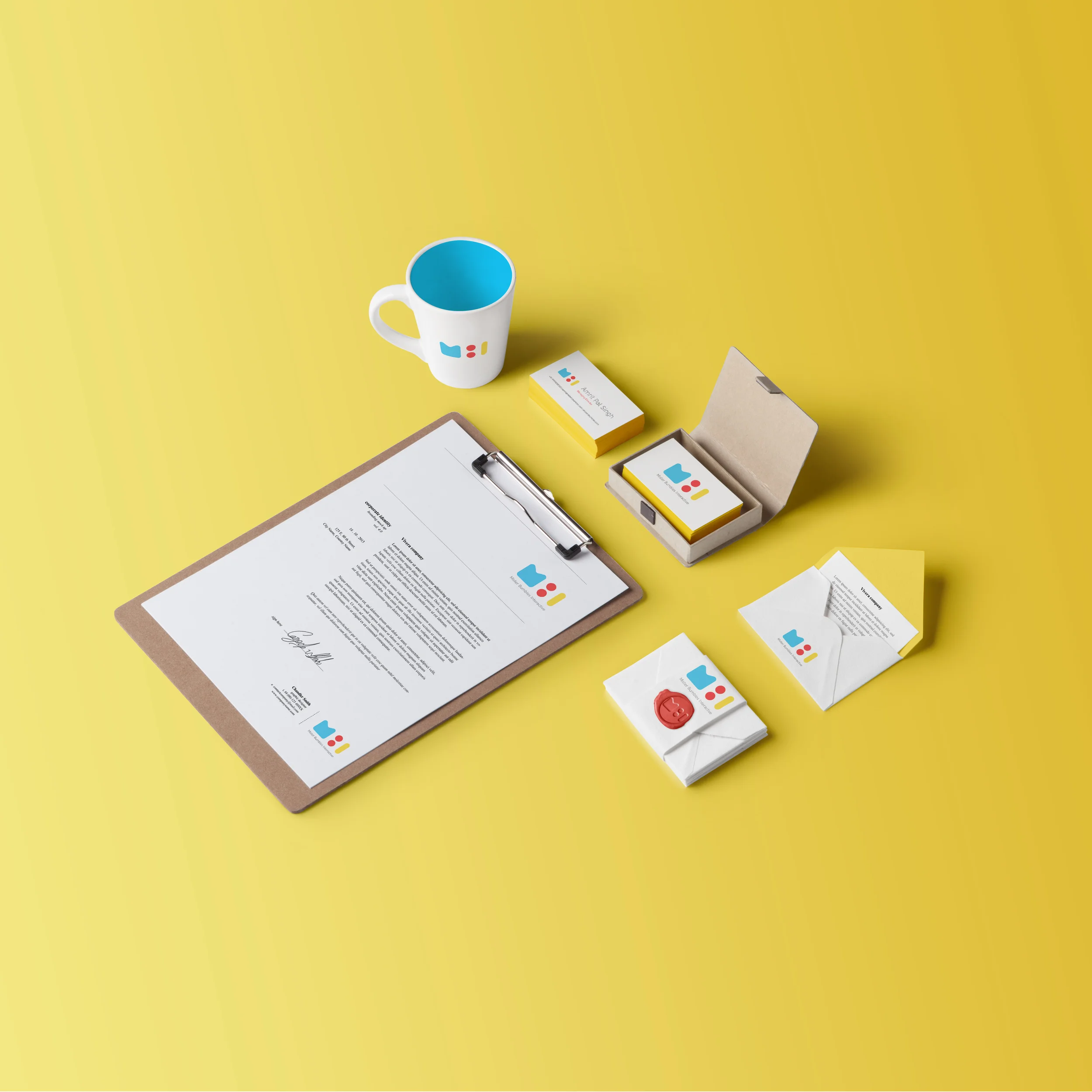
When designing MBI’s brand identity, our brief was simple, We wanted something long lasting compared to something trendy as trendy design eventually goes out of style like so called ‘Hipster Design’.
The generously rounded and bold shapes forming the initials M,B and I in blue, red and yellow are just as adorable as they are elegant: achieving the fluidity that the company has for itself. MBI produces content mainly for Motion, Branding and Interactive platforms, its repertoire extending beyond content just for kids: and the brand identity successfully reflects this versatility.
I also developed enriching service icons to make it very clear what services the company provides.
I took a non-conventional route and designed avatars based on personality rather than looks.
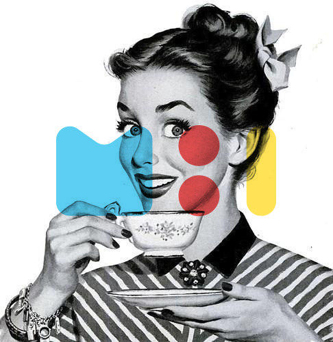
The company needed a playful presence on social media. So we played around with a vintage illustration and few patterns.
Elders of the industry tell you its very necessary to have a specially made GREYSCALE version of your logo and you ignore it because its all digital now.
Thats what happened to us and we faced a lot of issues with the current 3 color logo when printed in greyscale for invoices so we rectified the mistake and created a special logo for greyscale and we are super happy with i
Also got a small signage made with 3D Logo and the name is engraved whole thing lights up beautifully.


